Cards
Improve user experience with by emphasizing key points or links using customizable icons and images.
Icon Cards
WriteDocs integrates with Phospor Icons to provide you with a vast library of icons at hand, improving speed and style.
Attributes
This example demonstrates how to use a card with an icon and a link. Clicking on the card will take you to the Attributes heading.
Code for Icon Cards
<Card
title="Attributes"
description="This example demonstrates how to use a card with an icon and a link. Clicking on the card will take you to the Attributes heading."
link="/cards/#attributes"
icon="cards"
iconType='duotone'
iconSize='32px'
/>
Image Cards
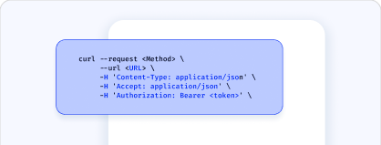
You can also create cards with images you designed.

Card 1
This example demonstrates how to use a card with an image.
Card 2
This example demonstrates how to use a card with an image.

Card 3
This example demonstrates how to use a card with an image.
Code for Image Cards
<Card
title="Card 1"
description="This example demonstrates how to use a card with an image."
link="/cards/#attributes"
image="/media/card_1.png"
/>
Attributes
title string
required
The title displayed on the card.
description string
A brief explanation of the card's purpose and behavior, shown beneath the title.
link string
The URL or path the Card links to when clicked.
icon string
The name of the icon displayed on the Card from the Phosphor Icons library, such as "address-book".
iconType string
Specifies the weight (or style) of the icon. The possible values are: thin
, light
, regular
, bold
, fill
, and duotone
. Default: regular
.
iconSize string
Defines the size of the icon in px. The default value is 32px.
Card Groups
Display cards side by side in a grid layout. The <CardList>
component allows you to organize multiple <Card>
components together, commonly used to align multiple cards within the same column.
You can add a cols
property to the CardList component to define the number of columns on the card grid. You can add up to 5 columns.
Duotone Card
This card shows a book icon with duotone weight.
Thin Card
This card shows an airplane icon with thin weight.
Regular Card
This card shows an alarm icon with regular weight.
Filled Card
This card shows a club icon with filled weight.
Code for Card Groups
<CardList cols={4}>
<Card
title="Duotone Card"
icon="Book"
description="This card shows a book icon with duotone weight."
iconType='duotone'
/>
<Card
title="Thin Card"
icon="airplane"
description="This card shows an airplane icon with thin weight."
iconType='thin'
/>
<Card
title="Regular Card"
icon="alarm"
description="This card shows an alarm icon with regular weight."
iconType='regular'
/>
<Card
title="Filled Card"
icon="club"
description="This card shows a club icon with filled weight."
iconType='fill'
/>
</CardList>